BRAND IDENTITY
RSI Construction
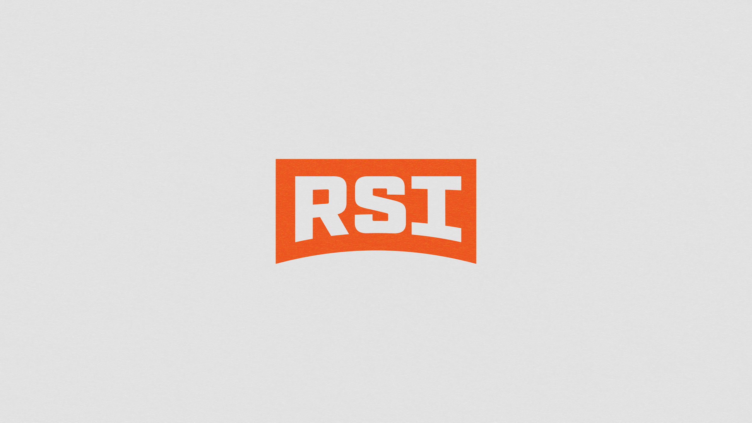
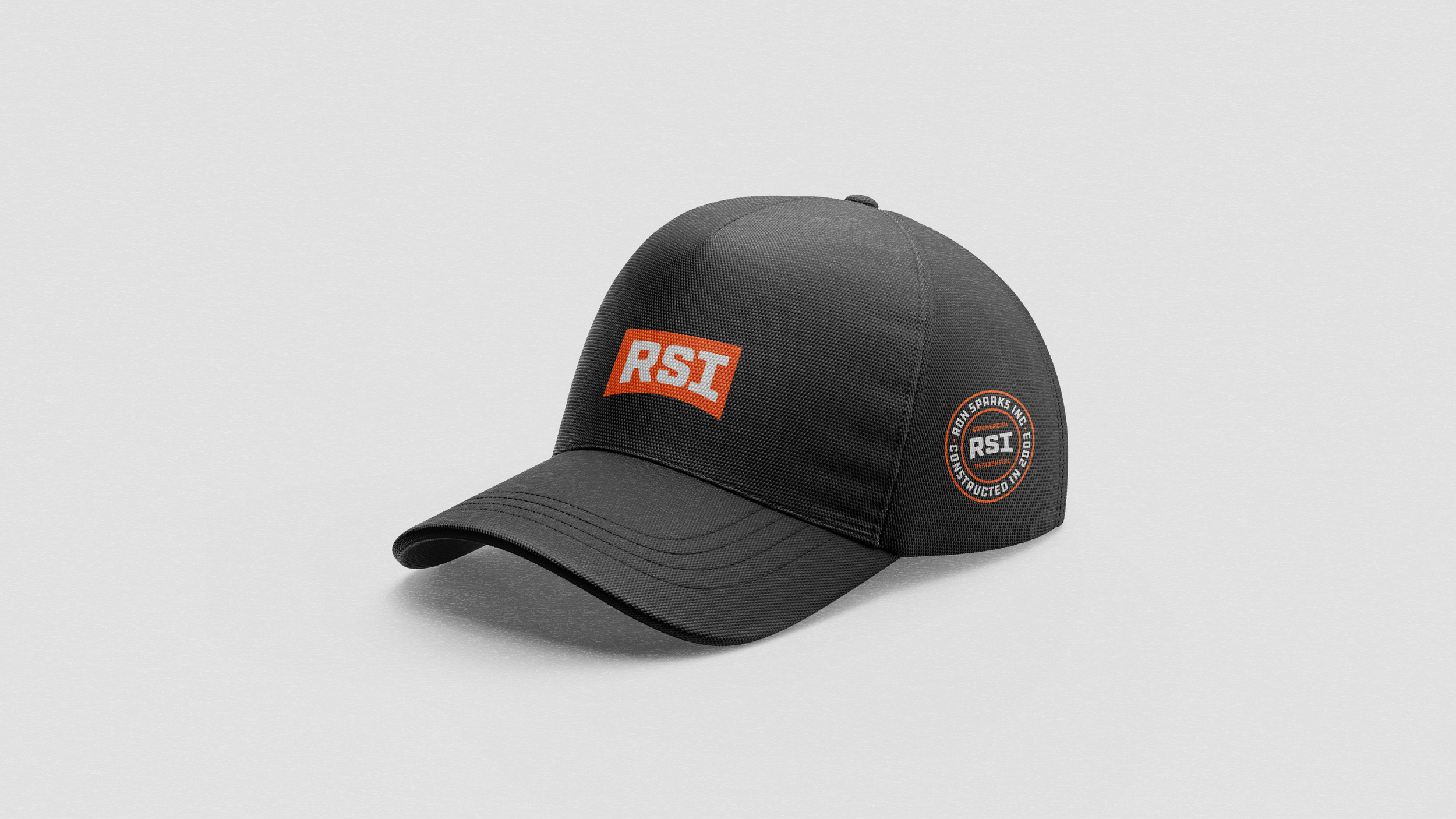
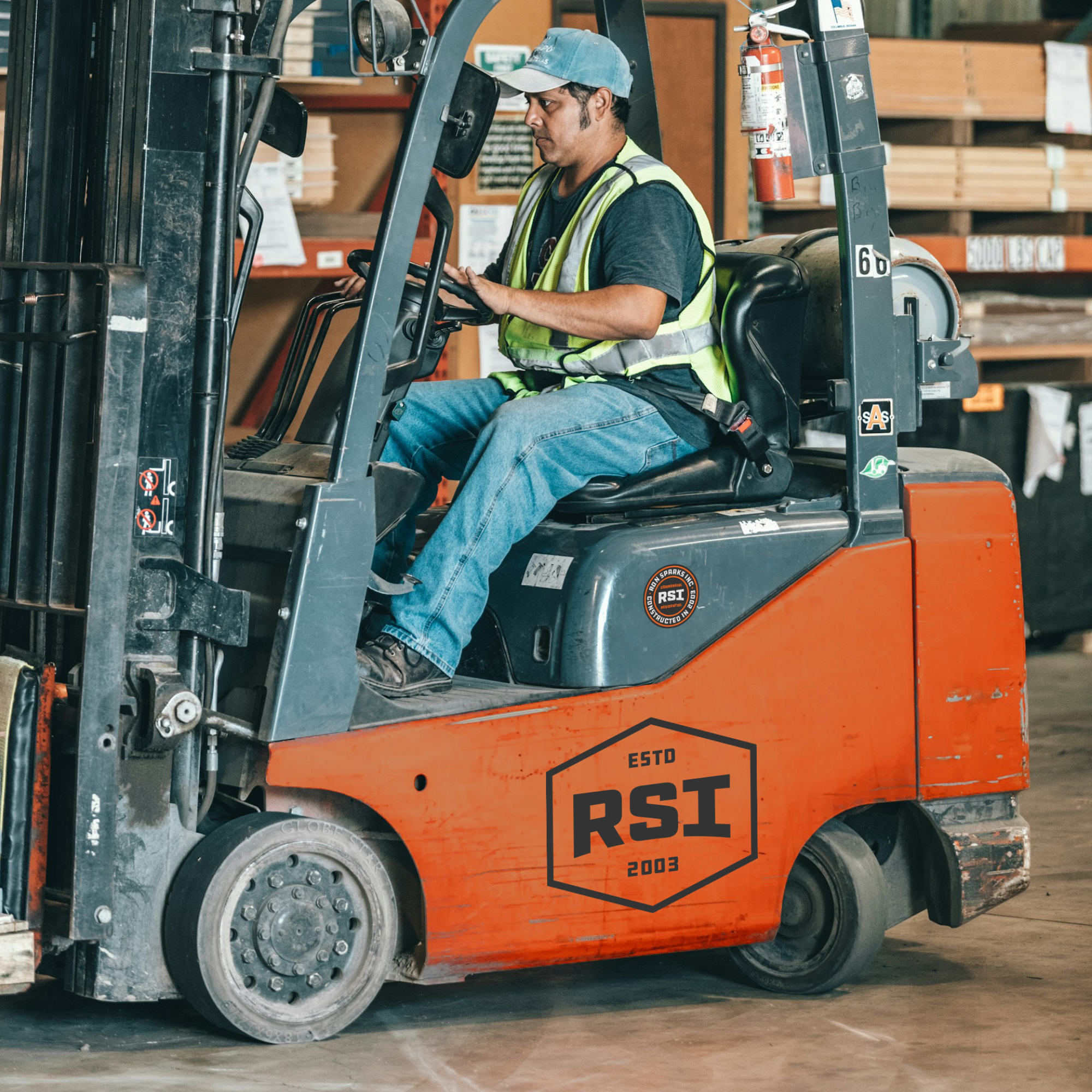
The RSI Construction wordmark was built to feel solid, dependable, and confident—just like the company itself. Its bold structure reflects the strength and professionalism behind every project. A subtle bow-curve cut into the letterforms brings a distinctive edge, hinting at RSI’s ability to bend with the demands of each job while never breaking from its core values.
CONCEPT:
GOAL:
The goal was to revitalize RSI’s identity with a mark that speaks to both legacy and evolution. By creating a clean, impactful wordmark with a thoughtful design detail, we aimed to set RSI apart as a company that’s not only built to last—but built to lead in a competitive industry.
Brand Designer: Triston Seay, Creative Director: Matt Johnson, Copywriter: Tom Schally
CREDIT: